Grosse Pointe Public Library Brand Guide

Master Brand Variations

Building on the region’s legacy and history, the Grosse Pointe Public Library brand references the architectural and cultural connections it holds with the surrounding community. The mark references the creative artwork of Pewabic, in Detroit. The logotype references the mid-century design, signage and typography of the physical space.

Horizontal

Gpl Horizontal Hex

Horizontal Lockup

Gpl Horizontal Reverse

Horizontal Reversed Lockup

Gpl Horizontal Reverse Hex

Horizontal Reversed in Blue Lockup

Gppl Horizontal Black

Horizontal Lockup in Black

Vertical

Gpl Vertical Hex

Vertical Lockup

Gpl Vertical Reverse

Vertical Reversed Lockup

Gpl Vertical Reverse Hex

Vertical Reversed in Blue Lockup

Gppl Vertical Black

Vertical Lockup in Black

Type Only

In limited use applications, the logotype may be used separate from the mark.

Gpl Type Hex
Gpl Type Reversed

Type Only Reversed

Gppl Type Black

Type Only in Black

Mark Only

In limited use applications, the mark may be used separate from the logotype. However, the logotype treatment must appear elsewhere within the same application for brand recognition. All clear space rules still apply.

Gppl Mark Blue Hex

Mark

Gppl Mark Reverse

Mark Reversed

Gppl Mark Black

Mark in Black

Branch Lockups

Each Grosse Pointe Public Library branch has three color versions to choose from. Color contrast should be considered when choosing a branch lockup.

Central Horz Seafoam Hex

Horizontal Branch Lockup in Seafoam

Central Horz Teal Hex

Horizontal Branch Lockup in Teal

Central Horz Yellow Hex

Horizontal Branch Lockup in Yellow

Central Horz Black

Horizontal Branch Lockup in Black

Central Horz Reverse

Horizontal Reversed Branch Lockup

Central Vertical Seafoam Hex

Vertical Branch Lockup in Seafoam

Central Vertical Teal Hex

Vertical Branch Lockup in Teal

Central Vertical Yellow Hex

Vertical Branch Lockup in Yellow

Central Vertical Black

Vertical Branch Lockup in Black

Central Vertical Reverse

Vertical Branch Lockup in White

Clear Space

A key element of Grosse Pointe Public Library’s brand consistency and style is the use of spacing in and around the logo lockup itself. Please make sure there is ample clear space from other competing visual elements on the page or screen, by following the guidelines outlined below.

Gpl Clearspace All

Placement

All versions of the logo should always be aligned to the left margin of any layout. Whenever possible, the logo should also be aligned with the top or bottom margin of a layout.

Minimum Size

Keep the brand fully accessible by adhering to these guidelines when scaling the logo.

Gpl Clearspace All 15 15

Violations

In order to maintain a consistent brand image, please don’t alter the logomark or logotype in any way. Below are a few examples of violations of the Grosse Pointe Public Library’s brand.

Gpl Violation11

Don't crop the logo

Gpl Violation10

Don't apply drop shadows

Gpl Violation9Alt

Don't stretch or distort the logo

Gpl Violation1

Don't change the brand colors

Gpl Violation3

Don't change the lockup spacing

Gpl Violation4

Don't rotate the logo


Color Palette

Deep Blue

HEX: #0D5880

RGB: 13, 88, 128

CMYK: 89, 52, 19, 2

PMS: 2945

Primary Blue

HEX: #1C7EAF

RGB: 28, 126, 175

CMYK: 72, 30, 0, 0

PMS: 7689

Teal

HEX: #009997

RGB: 0, 153, 151

CMYK: 73, 6, 30, 0

PMS: 7710

Seafoam

HEX: #90D2CC

RGB: 144, 210, 204

CMYK: 33, 0, 14, 0

PMS: 628

Yellow

HEX: #FDC876

RGB: 253, 200, 118

CMYK: 0, 16, 54, 0

PMS: 7403


Primary Headline Typeface

The URW DIN Semi-condensed is available for free through Adobe Fonts when used in conjunction with an Adobe Creative Cloud subscription. Individual font licenses can be purchased online, as well.

Visit Adobe Fonts Purchase fonts
Din Cond Thin

URW DIN SemiCond Thin

Din Cond Bold

URW DIN SemiCond Bold

Primary Body Typeface

The URW DIN Light and Bold are also available through Adobe Fonts or can be purchased online at the link below.

Visit Adobe Fonts Purchase fonts
Din Light

URW DIN Light

Din Bold

URW DIN Bold

Alternate Typography

For limited use circumstances where access to URW DIN is not possible, please use Roboto Condensed in its place. This typeface is available for free through Google Fonts.

Visit Google Fonts Download FAQ
Roboto Condensed Light Adj

Roboto Condensed Light

Roboto Condensed Regular Adj

Roboto Condensed Regular

Roboto Condensed Bold Adj

Roboto Condensed Bold


Using the Grid

When creating brand visuals, the consistent use of a grid is a key component of the Grosse Pointe Public Library brand. The grid draws inspiration from the logo’s spacing and structure. The space between the mark and the logotype becomes the unit of measure between different design elements on the grid. Below are examples of appropriate grid use, as well as examples for furthering the grid in specific applications.

Grid Clear Space

For uniformity in using the grid, it’s important to maintain consistent clear space between grid elements. The minimum space between elements will vary depending on what type of element it is: competing or non-competing. Please refer to the diagrams below.

1 unit to non-competing elements:
Must include one unit between all non-competing container” elements such as color blocks, photography, and the GPPL logo.

4 units to competing elements:
Must include minimum of four units between visually competing elements such as typed words, other logos, and busy backgrounds

Gpl Clearspace All 13 12

Correct use: 1 unit between non-competing elements, minimum 4 units between competing-elements

Gpl Clearspace All 13 14

Correct use: Minimum 4 units between competing elements

Gpl Clearspace All 14 16

Incorrect use: Must include one unit between logo and container elements (color blocks)

Grid Templates

Please refer to the following diagrams for applying the grid as a template. Examples include a page header, page footer, and event flyer. PDF diagrams are available for download in the Applications section of the style guide.

Gpl Guidelines Header

Basic Header Layout

Basic Footer Treatment

Basic Footer Layout

Gpl Flyer 9 181008 163319

GPL Guidelines Flyer 9


Patterns

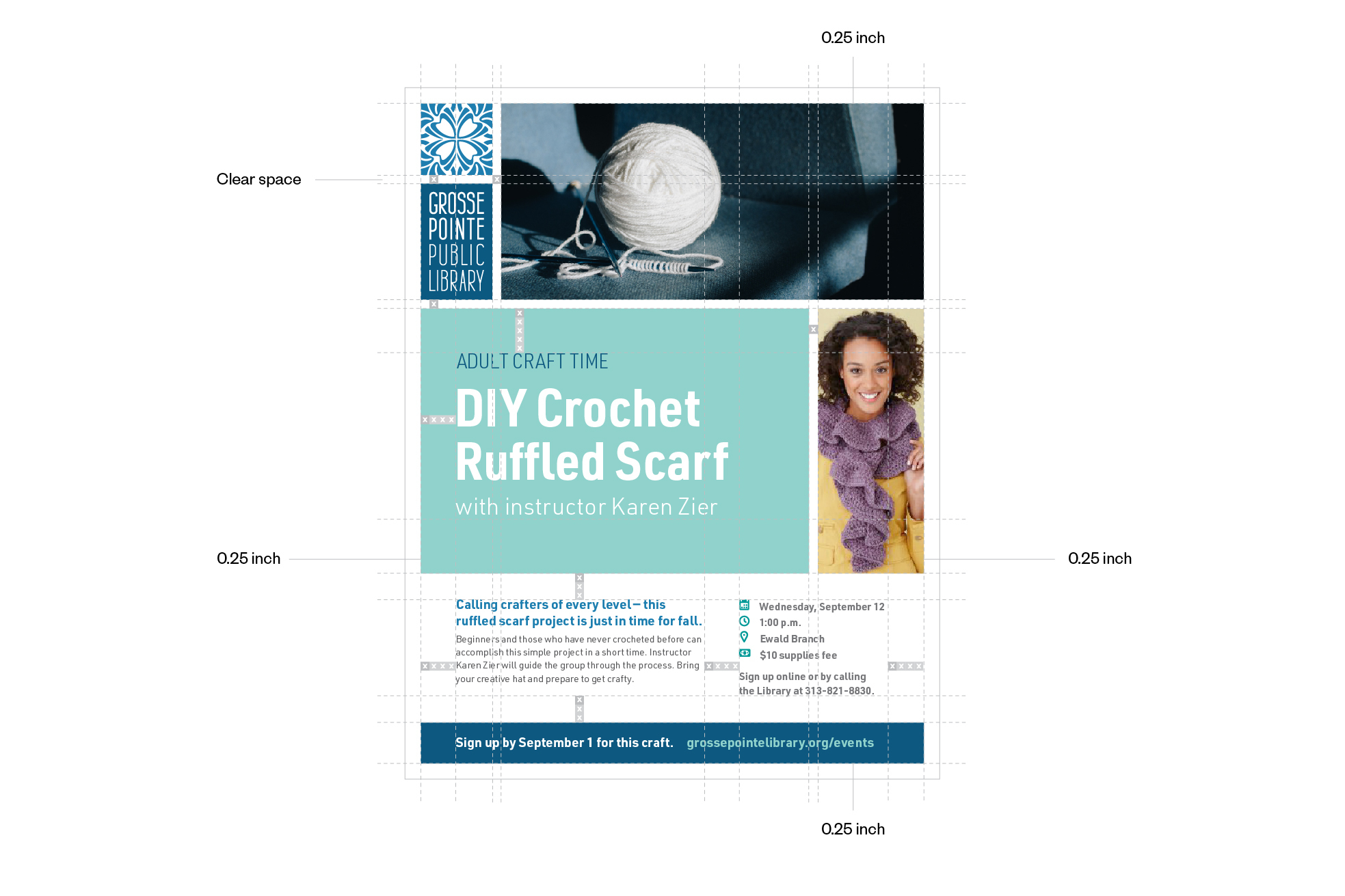
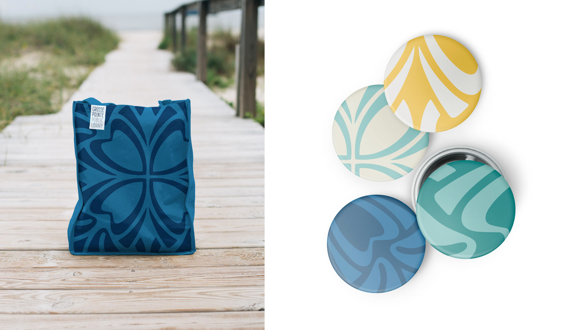
To further extend the brand’s personality, the mark may be used to create large scale background patterns. When creating such patterns, aim for showcasing details of the logo, rather than creating symmetrical or predictable patterns. Use of the pattern is to be limited, and reserved only for special treatments. Layering elements over top of the patterns, such as text or other images, is discouraged — it is best to use these patterns in an area on their own.

Attached are six different variations of the pattern in various colors and orientations. All are set up at an 8.5″ x 11″ size and in multiple file formats for various uses you may need. Additional variations can also be created using the Mark Only” version of the logo, but the rules below must be followed. Please refer to the following examples of proper and improper use of patterns.

GPL Pattern Blue

Use tints and shades of the brand colors for best results

GPL Pattern Yellow

Strive for asymmetry to create a more organic feel

GPL Pattern Seafoam

Highlight interesting shapes within the mark

Gpl Pattern1

Do not use the mark to create tiled patterns


Paper Stock

Paper stock is a subtle and important detail within the brand’s visual language – it makes each touchpoint of the brand feel part of the family as well as sets the appropriate tone.

It is recommended that the following paper stocks are used for all Grosse Pointe Public Library branded materials. When working with print vendors, you can specify the paper stock with the specifications below. For internally printed materials, you can purchase 8.511 stock to have on-hand and feed through your printer.

A link to purchase the stock can be found below.


Text-weight Paper

  • Line: Neenah Classic Crest
  • Color: Potomac
  • Weight: 24W
  • Finish: Smooth

Cover-weight Paper

  • Line: Neenah Classic Crest
  • Color: Potomac
  • Weight: 80C
  • Finish: Smooth
Order the paper stock

Photography Overview

There are four categories of images that are recommended for Grosse Pointe Public Library:

  • General Library Usage
  • Resources in Use
  • Events/​Programming
  • Conceptual

Each category is outlined below in more detail with examples.

In addition to these four categories, branch-specific images are recommended including:

  • Exterior
  • Interior (with people using the space)
  • Special artwork & architecture highlights

Tone & Feel

  • Include diversity in race, age, gender, religion, background
  • Photos with some human element in them
  • Natural, candid-feeling photos
  • Lots of natural light
  • Full color
  • Shallow depth of field whenever possible
  • Nice wide images for web

General Library Usage

The Grosse Pointe Public Library has beautiful and welcoming facilities. Images showcasing the public enjoying and using the space and on-campus resources and services is a great baseline of photography to have on-hand and utilize. Natural, candid-feeling photos are best, but planning and staging these shots is recommended.

467690068 1024X1024
508858058 1024X1024
520174462 1024X1024
524725544 1024X1024
622016438 1024X1024
637250178 1024X1024
688892916 1024X1024
862661268 1024X1024
956725680 1024X1024
964284164 1024X1024
647280728 1024X1024
624695918 1024X1024
Adobestock 118488147 Preview
Adobestock 128130222 Preview
Adobestock 128865435 Preview
Adobestock 167105688 Preview
Adobestock 193574683 Preview
Adobestock 99148370 Preview
Santi Vedri 707620 Unsplash
Rawpixel 649910 Unsplash 1
Alexis Brown 85793 Unsplash
Priscilla Du Preez 623040 Unsplash
Clay Banks 258326 Unsplash 1
Studio Republic 644339 Unsplash

Resources in Use

Many of the resources provided by the Grosse Pointe Public Library are resources that will be used off-campus. Showing these in use not only highlights the offerings and flexibility, but it gives the chance to feature some of the more unique services such as wifi hot spots, the tool collection, and seed library. This helps dispel the traditional refined library stereotype by showcasing the active and engaging side of the resources and offerings.

489698698 1024X1024
514568824 1024X1024
538903590 1024X1024
544600076 1024X1024
547447370 1024X1024
614512092 1024X1024
636510424 1024X1024
Cassidy Phillips 695625 Unsplash
Jazmin Quaynor 36221 Unsplash
Jelleke Vanooteghem 340024 Unsplash
Le Tan 640851 Unsplash
M0851 55542 Unsplash
Neonbrand 637890 Unsplash
Priscilla Du Preez 735142 Unsplash
Tamarcus Brown 134928 Unsplash

Events & Programming

The Grosse Pointe Public Library is an active community center with a variety of events and programming. Capturing these events and programs when they’re happening is a great way to capture the spirit and range of the GPL day-to-day function, and share it.

Rawpixel 477806 Unsplash
Rawpixel 463437 Unsplash
Sophie Elvis 709125 Unsplash
Rafaela Biazi 754792 Unsplash
Markus Spiske 193031 Unsplash
David Lariviere 560672 Unsplash
511017078 1024X1024
530772108 1024X1024
533346575 1024X1024
625755076 1024X1024
Adobestock 204057110 Preview
Adobestock 60052886 Preview

Conceptual

This category is a bit more of a high-level take on photography. This is an area where you can convey a general concept like a season, an idea, or a feeling. It’s also a chance to highlight some of the tiled architectural elements that directly connect back to the Grosse Pointe Public Library brand.

915620278 1024X1024
Andrewmoore 4
Alex Geerts 424409 Unsplash
Screen Shot 2018 06 13 At 1 54 21 Pm
Screen Shot 2018 06 13 At 1 54 45 Pm
Chungkuk Bae 241046 Unsplash
Daniel Mccullough 348489 Unsplash
Summer Header
Img029A 1

Photo Recommendations for Download

If you would like to utilize these recommendations offline, a full photography recommendations PDF can be downloaded below.


Stationary

Every interaction — whether to an internal or external audience — is an opportunity to make an impression with the brand. Consistency among stationary materials, such as a business card or letterhead, presents a unified look and feel to the Library experience.

PDF version of all Formatting Guidelines, including Stationary, is available by clicking the download link at the end of this section.

Gpl Clearspace All 16 02

Standard Letterhead

Gpl Clearspace All 16 08
GPL Guidelines Envelope
GPL Guidelines Card Front
GPL Guidelines Card Back

Email Signature

To extend brand consistency to digital communication, a unified email signature makes use of the simplified logo and brand typography styles.

Instructions for implementing can be downloaded by selecting the Download Instructions for Use” button below the visual example.

Note: brand typefaces are not available through all email clients so slight variations in typography is expected.

See the signature
Email Signature


PowerPoint Presentation

Create branded presentations with the help of a custom PowerPoint template. The template utilizes Roboto Condensed, the alternate brand typeface, for ease of sharing across devices.


Horizontal Applications

In situations requiring an extreme horizontal design layout, Grosse Pointe Public Library” may be typeset in the brand font, in place of the rectangular logotype. If such a need arises, the square mark is to be used alongside the typesetting, in order to maintain brand recognition.

Please reference these parade banner examples for horizontal application.


Inspiration

Ready to start making? Below is a collection of successful brand materials for application inspiration.

Member Card
Buttonsbag
Letterhead
Business Cards
Horizontal Logo Usage Examples
Sign
Postcard